Toy, Retail
E-Commerce B2C Website Redesign


Tools
Figma
Photoshop
Client
Dragons Trading
Skills
Competitor Analysis
User Research
Usability Testing
User Flow
Information Architecture
Content Design
Responsive Design
Role
UX Designer
UX Researcher
Timeline
May 2023 - Aug 2023
(4 months)

Brief
Dragons Trading is a small local B2C business based in California, United States that sells toys and figures—primarily Funko! POP & Banpresto products. Since they are a small business operating in a highly competitive space, they are interested in expanding their customer base through their website.
Scope
Since Dragons Trading is currently unaware of their online customers’ pain points due to a lack of metrics, the primary project goals are to
conduct user research to identify problem areas on their website; and
provide suggestions on how to improve the online customer journey and overall discoverability of their primary products
Impact
After providing Dragons Trading my UX recommendations on how to improve their customer journey, they informed me that they plan to implement changes to their website!
How might we, through a website redesign,
01.
distinguish Dragons Trading from
their big name competitors?
02.
improve Dragons Trading’s website browsing experience for shoppers, new and old?
03.
highlight Dragon Trading’s competitive prices and discounts?
User Impressions
“If main purpose is to buy something,
pretty easy to do so"
“I see the sale items…50% off…love that!”
“Are these
lead images pixelated?"
"Hero section is kinda blurry..."
"If there is no cost difference,
I would buy from
a smaller independent store
to support a small business
over Amazon."
“Pretty generic Asian collectible website”
“Nothing
pops out much.”
In order to gain a better understanding of what could be considered the strengths and weaknesses of the company and its website, I surveyed 44 individuals between the ages of 16 and 45 years old who were aware of Funko! POP products. To understand what prompts or prevents consumers from shopping for Funko! POP products online, I interviewed 3 survey respondents who felt neutral or positive about Funko! POP products.
User Survey Findings
According to survey respondents, Dragons Trading’s website “works well” but does not feel unique or specialized. Compared to their competitors’ websites, their website was “average”, “normal”, and “as expected.” Dragons Trading and their competitors shared many similarities in not only website layout but also product pricing.
However, the current information architecture and categorization on Dragons Trading’s website felt inconsistent and confusing to visitors.
User Interview Findings
Through user interviews, I learned that most individuals preferred online shopping because they
appreciated seeing a variety of products at a glance
gravitated towards “good pricing” (ranging $15 - $20 for Funko! POP products)

User Persona
Challenges & Learnings
While the research phase of the project was challenging due to the limited pool of eligible participants, I was able to move forward with design decisions based off
competitive analysis
research on best practices; and
studies on UI commonly found on eCommerce websites
In order to determine the efficacy of my redesign, I conducted usability testing with 6 individuals between 20 - 34 years old, the age range of the majority of Dragons Trading’s potential customers.
With their valuable feedback, I was able to validate design decisions and pinpoint which components I could iterate on to improve the overall user experience.
Users appreciated key information provided upfront:
discounts / sales
limitations / restrictions
policies
steps to a process
While most usability test participants appreciated seeing all the information relevant to pre-order products upfront (e.g. cancellation policy, shipping & handling), a couple of participants found the amount of text on the product detail page to be overwhelming. In fact, one participant compared the page to a resume.
In order to render the content more digestible, I added color to specific segments and variation to the text alignment.
Users instantly ignored any information and/or images that they deemed irrelevant:
large banners
obstructive pop-up windows
Dragons Trading’s original website featured large, colorful graphics promoting other brands they sold (e.g. Banpresto). While they were certainly “eye catching”, they were also described by user participants as “eye straining.” For individuals who were unfamiliar with the brand, the banners were distracting and largely ignored because they were mistaken for third party advertisements.
Taking into consideration this feedback, I removed the large graphic from the landing page and decreased the amount of vertical space occupied by content. As a result, and page appeared more clean and compact.

Product Detail Page Redesign

Landing Page Redesign
Key Changes in Website Redesign
Levereged Dragons Trading’s brand story to distinguish them from their competitors
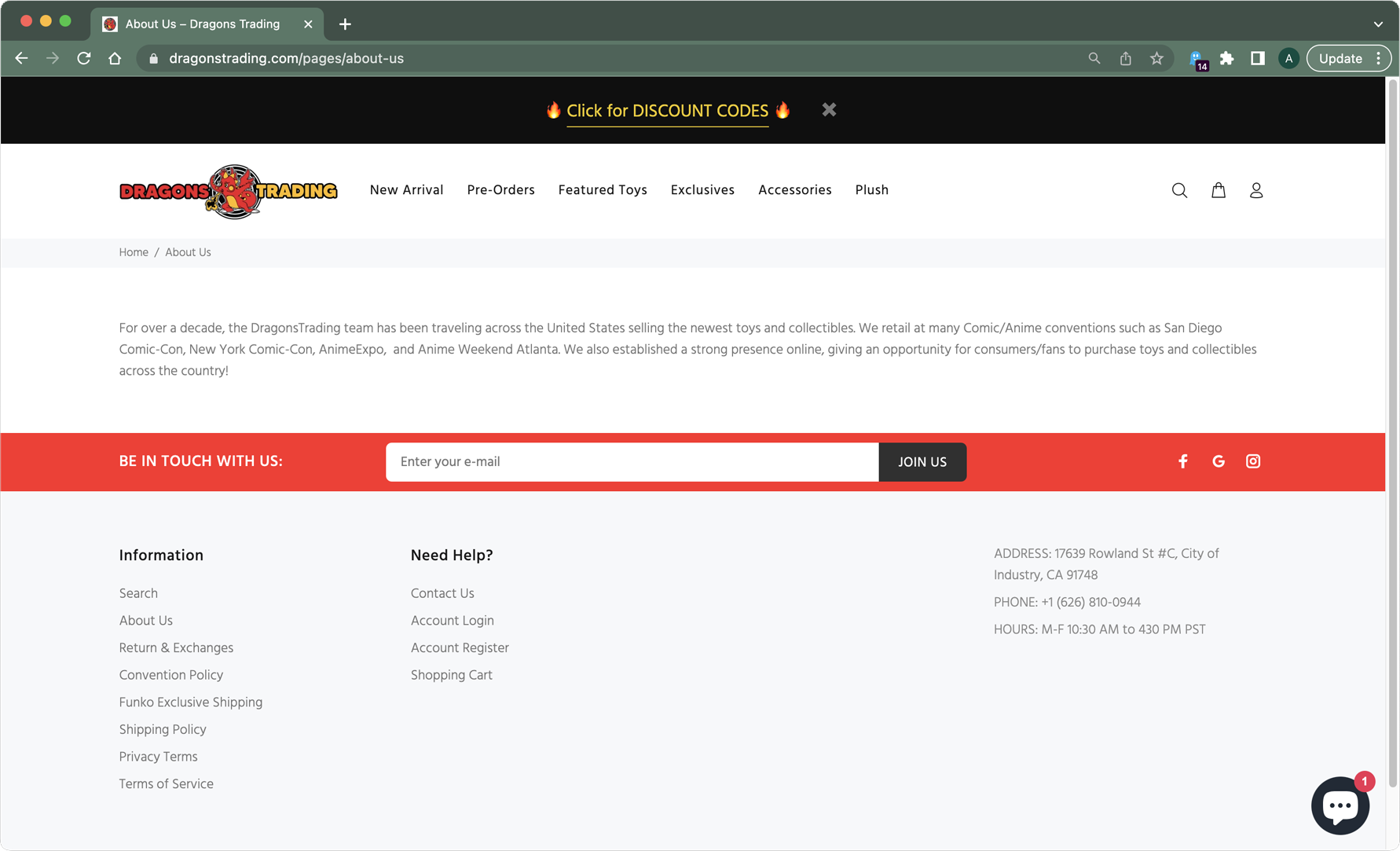
I called attention to Dragon Trading’s status as a small business on every page of the redesigned website by affixing their brand story to the footer.
On the original website, this information is hidden from plain view and only accessible through the “About Us” link in the footer.
→
Original

→

Redesign
Redesigned Dragons Trading’s product listing page to improve browsing experience for shoppers
Streamlined filter categories & sort options
Separated product name into multiple lines
Added borders around product images

Original


Redesign
Redesigned Dragons Trading’s product detail page to improve browsing experience for shoppers
Created more subheadings to allow users to find specific content (e.g. product specs & features) more easily
Positioned important info to the top (e.g. expecting shipping, pre-order quantity limit)
Added color background to highlight important policies

Redesign

Original
Highlighted Dragons Trading’s competitive prices and discounts
In the redesign, I made the discount code more prominent on the landing page.
On the original website, the discount code is easily overlooked because it is only accessible through the link on a banner that the majority of my user research participants scroll past.
←
Redesign

←
Original